
The way that the window is placed in this shot shows the rule of thirds. The dark colors in the window draw your eyes away from the red brick wall in the background. I also think that it is easy for your eye to wonder to the gray wall at the top of this photo.

This is an example of the rule of thirds and of leading lines. your eyes go to the green and purples in the flowers. Then overtime you look to the empty corner.

The mouse in the photo immediately grabs you eyes. everything else in this photo is only background.

Different form the picture above, a lot of things are going on in this photo. there are books, chairs and tons colors. However my eyes are focused on the button in the corner.

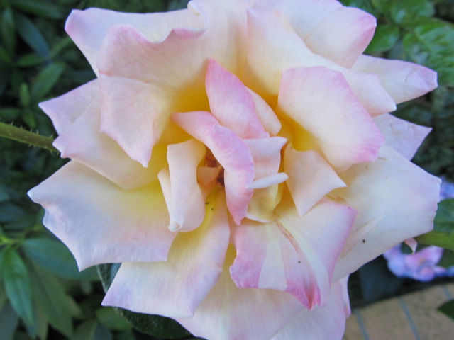
In this photo the flower is the subject. I've taken pictures of these flowers before but through this assignment have realized that this is flower is a lot more interesting ion the corner.

This photo is mostly green but the way the light hit this photo you focus on the light green. There are shadows on the lower leaves that cause you to most look at them first. I also like that way that this was shot from. I focused on the top not so much as having the subject on the side.

This is a really plain photo but I really like it. I think that if this had the same amount of colors as one of the top photos it would not works at well. the falling stairs create depth. this pot has leading lines, repetition that shows depth and it also has the rule of thirds in it. and at the time I took it I did not realize this.

This photo is all about color. the blue in this really grabs your attention. I think that the green in the background make the subject stand out more.

I have found a theme in my photos. I really like brick backgrounds. They constantly appear in my assignments. this may be because of the limited space I have to shot in or made it is what I have become use to. I realty like how ever though the 'DREW' in this photo is huge you really don't focus on this. Instead I find myself starring at the brick background.


